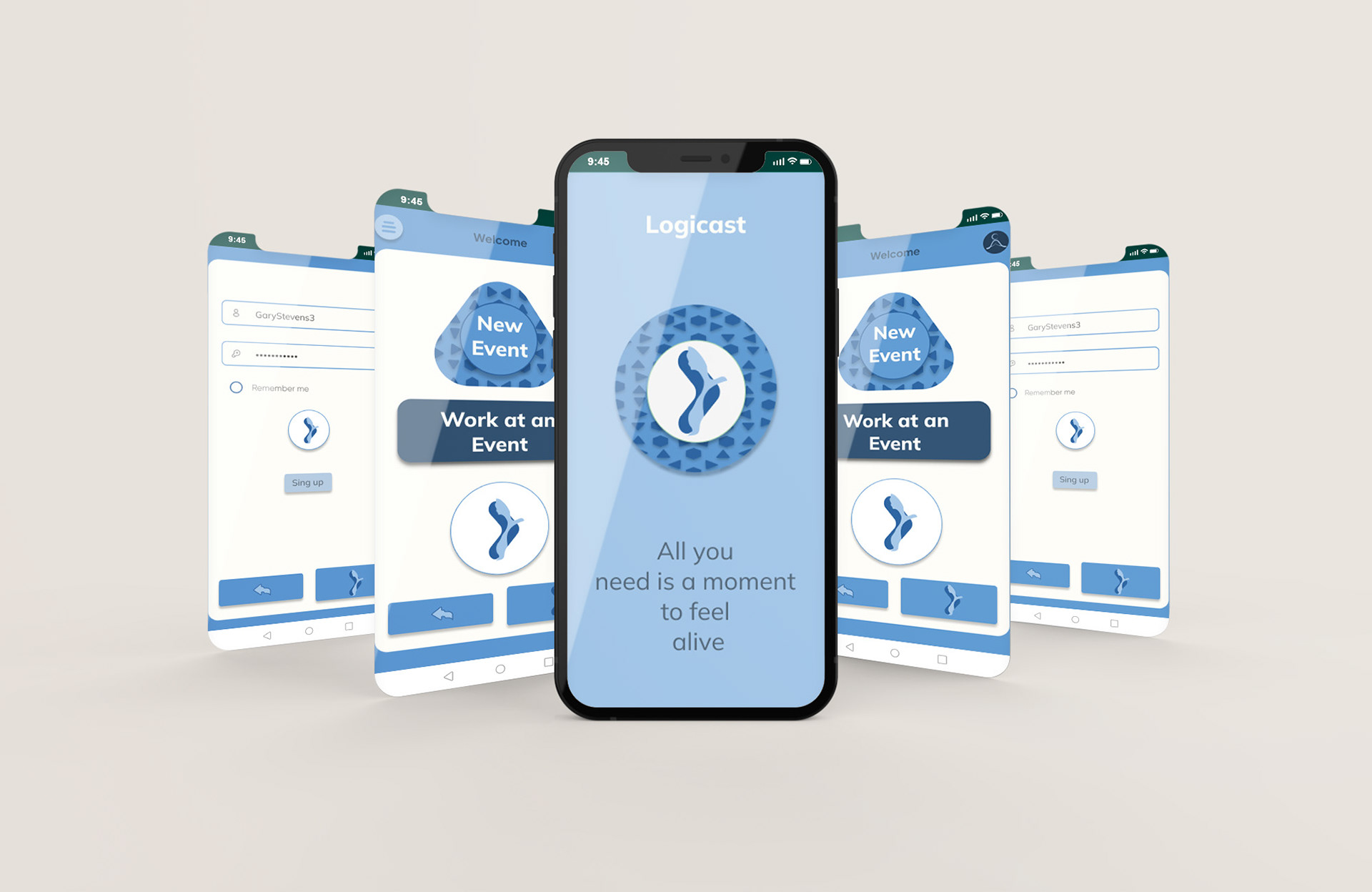
Imagine being able to plan every detail of your next event with one app. Logicast was born to turn the celebration of your dreams into a reality. Logicast is a logistics app that allows users to create, modify, and track their events. It was designed to make party planning easy, reliable, and enjoyable.
Design Challenges
The problem to solve was the level of difficulty involved in planning an event with multiple elements, such as a venue, catered food, drink, music, entertainment, etc.
Party planning, whether it be a birthday or another type of celebration, can be overwhelming and complicated.
Party planning, whether it be a birthday or another type of celebration, can be overwhelming and complicated.
Imagine this scene: Your daughter has a graduation party and the musicians are not on time, the party has already begun and there is no way to know how long they are going to take, you take your phone and call them just to figure it out that they were lost. At the same time, you receive a call from your partner who is picking up the cake and doesn’t remember what your daughter’s favorite flavor is. At the last minute, anything can go wrong, and you don’t want to be caught in a pickle! It’s better to have everything organized from the get-go.
The ideation process
The ideal solution
Logicast was intended to be like your best friend when you are planning an event, party, or celebration.
Big Picture Storyboard
The goal of Logicast is to provide users with a simple, straightforward experience to create and host an event.
Close-up Storyboard
When ideating, I knew how important it is to have a solid plan. Logicast was meant to be trustworthy, like a helpful friend who is always a step ahead.
Understanding the User
User research summary
In my usability study, I wanted to know if the app was usable, accessible, and enjoyable when asked to complete a task. In order to know the user needs, I conducted a Usability Study, as a primary research method. In order to gather both qualitative and quantitative data, the model I used was an Unmoderated Usability Study. I consider that system usability studies and user error rates had the potential to show how to address usable issues and help improve the design based on user research data. Besides, I thought conversion rates may help to address the equitable pain points.
User Journey Map
Starting the Design
Paper Wireframes
These paper wireframes provided a first impression of the features’ layouts. They were created during a 6-minute design sprint activity.
I continued iterating on the designs based on the usability studies I conducted. If you want to check the complete study please review the Study Case for Logicast. In summary, here are the findings and insights that helped me during the design process.
Finishing the Design
Prototype
This is the final prototype with the main flow — providing more responsiveness and interaction. I implemented an option to save changes before leaving, as requested by users.
Link to prototype:
https://www.figma.com/proto/eXKcX6itPYm5VDYJbhuYXZ/Logicast-App?node-id=165%3A1638&scaling=min-zoom&page-id=164%3A3&starting-point-node-id=165%3A1638
Final Design


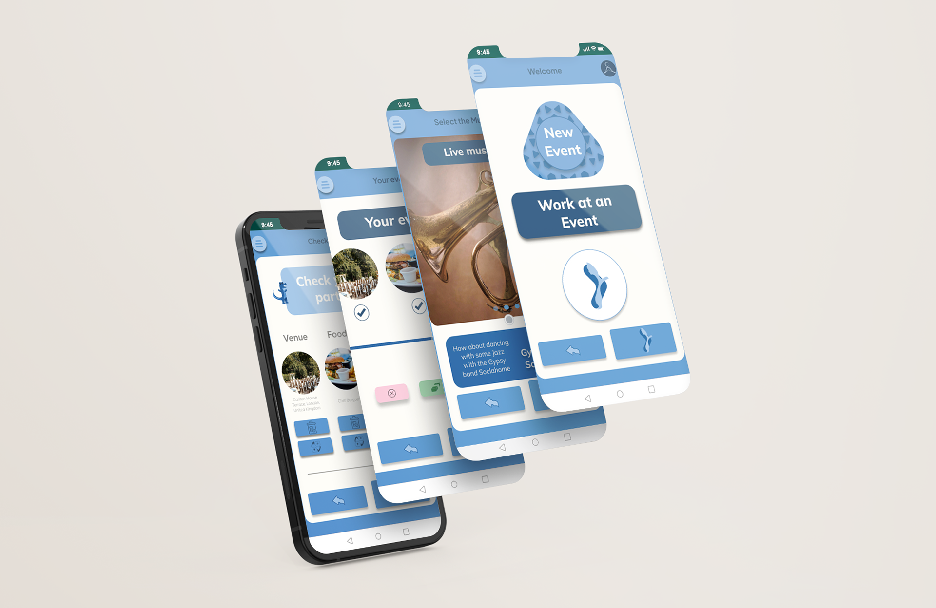
After a long process of incorporating insights into the designs, I was close to the final product. I wanted to give the design an original vibe. So, as a visual designer, I decided to create some visual elements from scratch, such as buttons, icons, logos, etc. As a result, I created a fresh and clear interface with a playful touch.
Thank you!
UX Designer
WhatsApp: +(57) 324-209-1742
Email: camilogutierrezdesign@gmail.com
